Warehouse Logistics App
iPhone App connected to Scanning Sled
Project Overview
At PayPal, I was the sole designer on the Warehouse Operations and Logistics team for Happy Returns. Three warehouses, called hubs, received returns from return bars in retail stores and through parcel mail. These return items go through two separate sortation processes, packed into shipping boxes, placed onto pallets, then shipped back to the different retailers on trucks.
Unfortunately, I am unable to show the exact designs I did for PayPal. So, I have recreated a similar demo to demonstrate one of the processes I designed and implemented for the transportation of materials across the warehouse. My designs directly increased processing speed of returns by 150%.

The designs were for a native iPhone app. While smartphone cameras have barcode scanning capability, it's not a great user experience. Luckily, there is a large availability of scanning sleds that can hold iPhones and interface with the native apps. The wrist strap allows the user to keep the scanner with them at all times, even while lifting boxes.
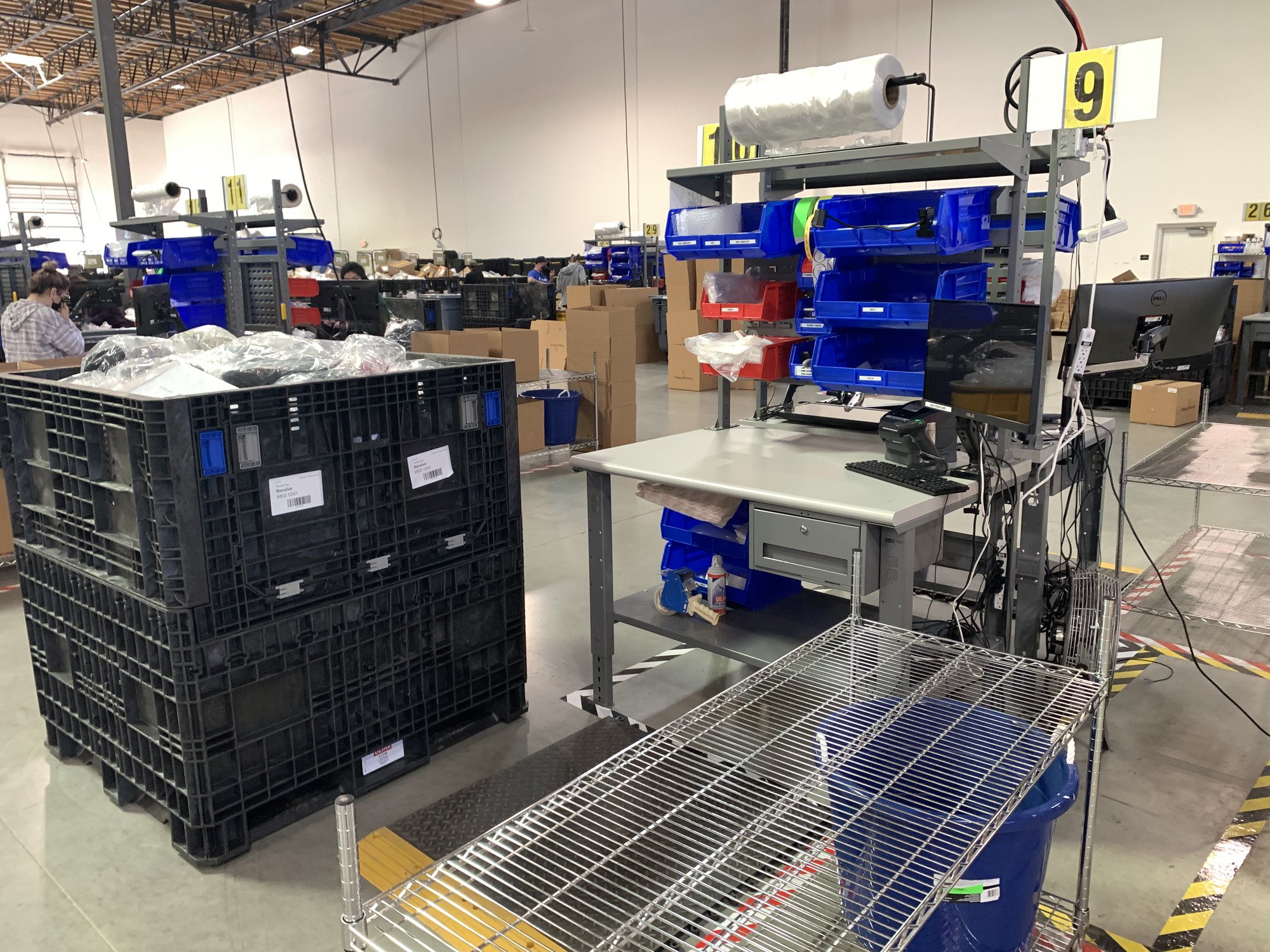
A processing station where specialists sort return items into shipping boxes specific to each retailer.
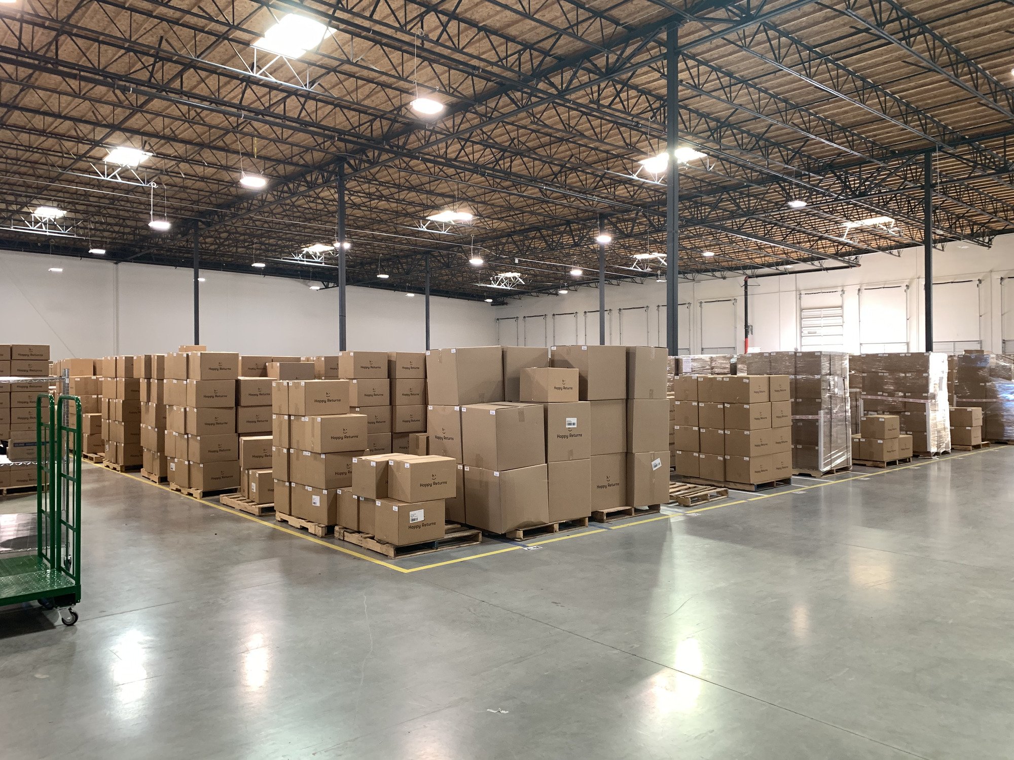
Shipping boxes on pallets. Once the pallet is full, it’s weighed, wrapped and placed in storage until it’s ready to be loaded onto a shipping truck.
User Research
I needed to make sure that I nailed my designs because if I didn’t, warehouse operations would grind to a halt. In HBO’s The Wire, they say “An officer is only as good as their informants.” This applies to UX Designers as well. Users are the most important when it comes to product research, specifically interviews and tests.
I spent a lot of time at the hub interviewing as many warehouse workers as I could, showing them the designs that I had in progress and walking them through a prototype to get their feedback. I also would do their warehouse processes myself to get a feel for what they were possibly needing to make their jobs easier and more efficient. I made sure that I knew how to do all of their tasks in order to be able to design well for it.
App Flow
*Please note: these are design wireframes. Colors and fonts were decided later. This shows a simple layout to understand the process of the app for the user.

Opening screen: the user can clearly see tasks that need to be accomplished, and pending requests for each task. The user sees that there are 62 finished shipping boxes at processing stations, so they tap on the task to view where the finished boxes are.

Scanning shipping boxes: Green arrows point to the screen the user sees when there is a successful barcode scan. Red arrows point to the screen for an incorrect barcode scan.

What next: Once the user has a cart full of boxes, they tap the cart icon to view where the shipping pallets are. The user can choose the order in which they visit each pallet.

Scanning boxes on to pallets: Very similar to loading the cart, except pallets can get full, so the user will be prompted to create a new pallet if needed, and designate the full one for weighing, wrapping, and storage. The finished pallets remain in storage until the truck picks up to deliver them to the retailer.

Finishing up: Once the user has scanned all of the boxes from their cart, they’re brought back to the home page to view the remaining tasks available.
Final Thoughts
This project took several months and lots of coordination and collaboration in order to get it right. I perform an extensive amount of user research in order to nail it. Happy Returns began this project to meet requirements to sign our biggest customer at the time. The customer required a signed Service Level Agreement that Happy Returns was, at the time, not capable of meeting. Within the first month of implementation of my designs, including the above Shipping Box to Pallet process, Happy Returns not only met, but surpassed the SLA by 100%. It resulted in an overall increase in warehouse productivity by 150%.